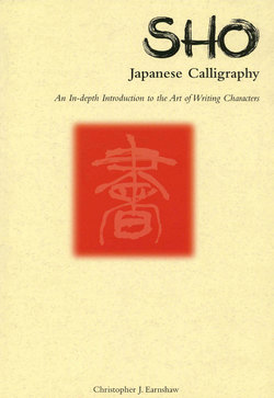
Читать книгу Sho Japanese Calligraphy - Christopher J. Earnshaw - Страница 9
На сайте Литреса книга снята с продажи.
ОглавлениеThe Beauty of
Japanese Calligraphy
There is no riddle to calligraphy; It is simply a formula which combines the skill and imagination of a person who has studied intensely the combinations available to him with only lines. His is but to build wonderful structures without hesitation, mistake or variation with those simple lines. The pure power and rhythms of nature influence the artist and he interprets this to infuse his characters with “life”.
Good calligraphy is instantly discernable from bad to the trained eye, but as beauty is not an absolute quality, it is very difficult to demonstrate why this is so. Nevertheless here are a few guidelines to help explain:
a) There is a natural balance in both the characters and the composition as a whole.
b) There is an abstract beauty in the line which may be subdivided and evaluated thus:
1) Straight lines are strong, solid and clear.
2) Curved lines are delicate, feminine and mobile.
3) There is a variance in the thickness and thinness of the lines.
4) The amount of ink on the brush or the lack of it (cf. kasure) is consistent throughout the work.
5) The size of the characters are of a scale which give a pulse to the work.
6) The colour of the ink, kasure, the pulse and the quality of the lines combine to form rhythm!
Calligraphy provides a two-fold pleasure to the beholder; an aesthetic visual stimulus as well as an aural excitement. Here, however, we will concern ourselves with only the visual aspect. As a single stroke may not be touched up or rewritten, any lack of talent is immediately apparent. If any one of the above points is missing, it is as glaring as discord in a Bach concerto. This perfect coordination between hand and mind takes years of practice. For all that however, legibility, or as we think of it neatness, is not a controlling factor.
Many people think of calligraphy in terms of dancing, but I prefer to think that classical music, being stricter, is a more apt comparison. A pianist achieves success or not as the case may be, through his interpretation of the myriad notes of a piece of music. A poem lies beside the calligrapher like a piece of music. Likewise his success depends upon the appeal in its presentation.
The pianist peers at signs beneath the notes telling him to crash loudly, tinkle softly or race ahead. In the same way the calligrapher receives clues in the meaning of the words. Both the musical piece and the work of calligraphy may be “recorded” for posterity, one on acetate and the other on paper. It is the person who owns these articles who has the privilege of a private experience when he listens to the music or gazes at the calligraphy.
As any pianist will tell you, compositions must adhere to general rules or the result becomes nonsensical. Introducing rules for a keener appreciation of calligraphy and the means, if possible, to act as a springboard for one’s self expression through the medium of the craft, are the aims of this book. One cannot forever be playing Chopsticks on the piano while all those sonatas are waiting to be played.
The Chinese attach great importance to their handwriting, not only because it once opened doors to higher positions in government by way of the Civil Service examinations, but also because it is believed that one’s hand reveals a great deal about one’s character. Graphology, the art of inferring character through handwriting, is an established practice in China.
In the West calligraphy, “a beautiful hand” (copperplate, like engravers use) was supposed to suppress eccentricities in style. The Chinese, on the other hand, attempt to bring words to life, to actually endow them with “character.” Styles of handwriting are highly individualistic and differ from person to person, rather like the present state of handwriting in the West.
Calligraphy is highly involved yet simple in its own way. It is this paradox that offers the challenge. The finished product is simple, but the elements that go to make it up are not. Careful choice of the medium and subject, years of study and research, composition and lesser details including choice of a seal inkan, backing hyōgu, and framing ail play a role. To the unitiated person it appears the simplest product, but to those with an understanding of calligraphy it signals its pedigree. That it has a definite attraction is unmistakeable for often on visiting galleries one sees people gazing up at calligraphy, totally absorbed by lines and dots that bring such names of masters of the abstract as Jean Miro or Paul Klee.
Kōkotsumoji
