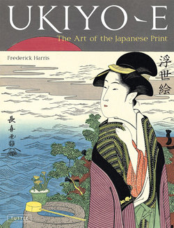
Читать книгу Ukiyo-e - Frederick Harris - Страница 9
На сайте Литреса книга снята с продажи.
ОглавлениеCHAPTER TWO
Materials and Techniques
When I first arrived in Japan in 1953, over a half-century ago, I had the opportunity to meet and work with a group of young artists in Kobe, who showed great interest in me personally and my experiences in art schools in New York. During those years there were not many American artists living and working in Japan. I was a novelty to them, as they were to me. When I mentioned that I had studied printmaking at the Art Students League, and that my teacher had worked in Japan prior to World War II, they asked if I would be interested in doing a part-time internship with a woodblock cutter and printer. He was a true craftsman who made a living producing matchbook covers, menus, coasters, name cards, etc., which at that time was the most common and inexpensive form of reproduction. I remember everything about him except, unfortunately, his name.
My recent reading on the subject of producing prints, and my research into modern methods confirmed my vivid memories of those many years ago.
It is important for readers to realize that the Japanese prints shown in this book were not created solely by the artists whose names appear on them. A symbiotic relationship existed between artist, woodblock carver and printer and the team coordinator, the publisher. The stages of making ukiyo-e —the design, carving, printing and publishing—were separate activities done by different and highly specialized artisans and thus were the products of a collaborative effort. In some cases, the artist did not even choose the colors that the print contains. There are, of course, many exceptions, but in most cases the volume of printing was so great that there was not enough time for the artist to supervise each production. He may not have even had the ability to do so. The carvers and printers were skilled craftsmen employed by a publisher who also paid the artist for his original design. The final product was then sold by the publisher to the public, with the artist’s signature, publisher’s name and sometimes the publisher’s address added to it. The woodblock carvers and the printers remained the unknown artisans of Japan. Their apprenticeship was long, sometimes up to ten years. Their devotion to their craft was absolute, but only in very rare instances did their names appear on a print.
FIGS. 21, 22
Cutting with a knife
Courtesy of Adachi Institute of Woodcut Prints
FIG. 23
Using a chisel to peel away the unwanted area
Courtesy of Adachi Institute of Woodcut Prints
FIG. 24
Printing with a baren
Author’s Collection
The process of creating ukiyo-e started with the artist. It was his job to produce a drawing or “preparatory picture,” called a shita-e, for the publisher in black sumi ink. Sometimes the artist would develop his drawing to a very high level of detail and completeness. At other times he would provide a more sketchy drawing, perhaps only showing the contours of his figures and suggestions for the background. The details were then filled in by professional block copyists (hikko), or even by advanced students. The hikko would then create a tracing or “base block picture” (hanshita-e) on very thin translucent paper, which was then passed to the block cutter for the next stage—transferring the design to the woodblock.
Traditional Japanese woodblock prints were made from designs carved into planks or blocks of cherry wood (sakura), a moderately hard, fine-textured, straight-grained wood suited to carving designs in high relief. Cherry wood was also fairly resistant to warping caused by the wet pigments and moist paper used in the printing process. The blocks, about 3.5 cm thick, were the product of years of drying and curing and creating a surface that was suitable to carve before they were cut up into workable sizes. Because the block cutter worked on both sides of the wood, care had to be taken not to damage either the top or the reverse of the block.
Traditionally, the carver sits on a cushion (zabuton) at a low table. The angle of his work surface is at the level of his bent arm. He first places the hanshita-e block design face down on the block of wood, which is covered with an even coating of glue (nori) made from rice flour and water. The drawing is carefully pressed onto this sticky surface. The back of the drawing is then carefully rubbed with the hand to remove the fibers from the paper so that the black sumi lines are visible for the cutting process to come. Basically, one is exposing the drawing from the rear. I remember from my experience at the craftsman’s studio that rubbing the paper is a difficult task. The paper is so thin that the chances of making a hole in it are great. I had to practice in areas where there were no sumi lines. After the glued paper has dried, the block is brushed with a light coating of oil so that the sumi lines are clearly visible.
Next comes the cutting process, another delicate task (Figs. 21–23). Keeping in mind that the thin black lines and other surfaces remaining on the block comprise the printed image, the woodblock cutter cuts through the back of the paper into the wood, leaving the lines or areas of the design in high relief while cutting down into and removing the surrounding wood (Figs. 26, 27). The final design that is produced is called the “key block” (dai-ban). Carvers use as many as seven different tools—knives, gauges and chisels—for the cutting process. The most useful is the knife called hangito. The craftsman holds it upright and cuts the block at an angle of about 35 degrees, generally in the direction of the brush that initially inscribed the design. The tools are sharpened on stones ranging from rough to fine with oil. The sharpening of the tools itself is an elaborate procedure, just as taking care of the stones is.
While the earliest Japanese prints were almost always reproduced in monochrome black ink and required a single key block (Fig. 28), as soon as the growth of the popularity of ukiyo-e brought with it a demand for color, the woodblock cutter had to produce sets of blocks for each design since each color was produced from a different block. Thus, separate blocks had to be cut for each of the colors of the design in addition to the key block that was used to print the black outline. On the color blocks, all areas were cut or chiseled away except for the flat areas meant to take the colors, which were left in relief. If, however, two color areas were sufficiently separated from each other, sometimes these two colors could be printed from the same block. Altogether, block cutting was a time-consuming and demanding process that required the skilled hands of master carvers to replicate the unique and exact features in the artist’s original design, while at the same time demonstrating their own woodcarving talents.
Because color prints were produced from multiple blocks, with each block in a different color and sequentially impressed onto the paper, the woodblock carvers had to employ a system to insure that the image from the key block and the colors from the different color blocks would correspond perfectly on the same sheet of paper when printing. They developed a system of guide marks (kento), cut with a special chisel at the same two locations into every block used to make a single design. At the lower right-hand corner of the block they carved an L-shaped corner called kagi and in the lower left side a small rectangular straight piece called hikitsuke. The sheet of paper would fit into these two slots and be perfectly positioned every time on the individual blocks. The final print would thus bear the impressions of each of the blocks in perfect registration.
Now came the job of the printers. The pigments used for printing traditional prints were always water based, made either from mineral or organic (vegetable) sources. The most important is black sumi. It is produced mostly from burnt pine mixed with rapeseed oil to produce soot, which is formed into a stick called nikawa using glue. The same sumi stick or a liquid version called bokujyu is used in traditional Japanese painting. Sometimes the sumi was mixed with nikawa to produce a glossy finish. This was effective on hair or on some kimono patterns. As with their European counterparts, the other colors used were all primary colors— yellow, blue and red. As in Europe also, the translucent quality of these colors could be mixed to achieve a multitude of other hues. The introduction of Prussian blue in the eighteenth century had a great impact on Japanese landscape prints, especially those of the famed print artists Utagawa Hiroshige and Katsushika Hokusai.
Each pigment was applied to the blocks by the printers with a unique Japanese brush called a hake. It looks much like a Western-style scrubbing brush except the hairs come from the tail of a live horse. Once inserted into the wooden handle, the hairs are shredded on the surface of a dried shark’s fin. The hairs in a horse’s tail are hollow and the shredding leaves about a quarter of the hairs intact. When the brush is used to apply pigment, it is first dipped in water and then inserted into the pigment. Pressing down on the brush allows the water to mix with the pigment and flow evenly on the block. The block is dampened evenly with water, taking care to avoid any pooling or puddles. The care that the printer takes in making sure there is no excess ink or color adjacent to the cutting line is most important. The moistened paper is then gently laid down upon the inked surface of the block for printing, making sure that it is aligned with the registration marks carved into the blocks.
Traditional Japanese paper used in printmaking has a very long history in Japan. Originally developed in the first century in China, it found its way into Japan directly from China and also via Korea. The qualities of Chinese paper are extremely appealing. As a painter, I have used both kanshi (Chinese paper) and washi (Japanese paper). However, the paper used for woodblock printing needs strength to resist the strong pressures applied to it. It also has to be absorbent, flexible and stable when dampened for printing. The techniques and materials developed in Japan were found to be the most suitable for the woodblock printing process.
The three main papers used are kozo, gampi and mitsumata. Kozo, a generic name for three different types of mulberry trees that are grown as farm crops, is the most widely used. Trees two years or older have qualities in their bark and leaf structure which make them most suitable for the production of paper. The fiber produced is long, flexible and strong. Gampi paper is generally harvested from the wild in southern parts of Japan and is therefore relatively scarce. It is strong, translucent and thin, with a silky quality. Mitsumata, in the same family as gampi, is hardier and takes longer to grow but is expensive. Paper making in Japan is a study in itself, and beyond the scope of this book. But without the correct quality of paper available to the publisher, printmaking would never have succeeded.
The printers used a special pad called a baren to press or burnish the paper against the inked woodblock, thus applying the designs and colors from the woodblocks onto the paper (Figs. 24, 25). A disk-like pad about 15 cm in diameter that fits into the palm of the hand, with a flat bottom and on the reverse side a knotted handle, the baren is composed of a core (shin) of cord twisted from straw and/or bamboo fiber and arranged in a tight spiral, placed on a backing disk (ategawa) and wrapped in a cover (kawa) formed from a tightly wound and twisted bamboo sheath. Baren of differing thicknesses and cord fibers are used to achieve variable pressures during printing. Today, baren can be purchased. Like anything else, the finest quality is very expensive, but once bought and properly cared for can last a lifetime. The craftsman I worked with made his own baren using age-old methods. For example, he made the ategawa by gluing a sheet of minogami paper every day for 100 days onto a cylindrical block of wood. The grain of the paper was reversed every day. After the pad was completely dry, he covered it with a thin sheet of gauze brushed with black lacquer and then trimmed around the edges.
FIG. 25
Holding the baren in the proper position
Author’s Collection
FIG. 26
An original key block
(39 x 27 cm) from a drawing by Utagawa Kuniyoshi (1797–1861), which was a kawaraban (newsletter) inviting people to join in the festival of carrying the mikoshi (portable shrine). The amount of work that went into the carving is remarkable. It is a wonderful example of the carver’s craft.
Courtesy of Adachi Institute of Woodcut Prints
FIG. 27
Close-up of the same block
Courtesy of Adachi Institute of Woodcut Prints
FIG. 28
Monochrome print pulled from the block
Author’s Collection
FIG. 29
Utagawa HIROSHIGE
広重 (1797–1858)
Horikiri Iris Garden, from One Hundred Famous Views of Edo 堀切の花菖蒲 (1857)
Bokashi gradation technique, 39 x 27 cm
Courtesy of Mita Arts Gallery
In this series, Hiroshige showed his mastery of space by clearly distinguishing the foreground, middle ground and background. The flowers in the foreground are the main focus. The iris to the left is so close it becomes cropped. A closer examination of the print reveals young women in the middle ground and other figures further back. The design is simply marvelous, and is enhanced by the printer’s talent in the bokashi technique, as exemplified by the gradation of pink to white in the main iris, and the treatment of the sky. The light blue sky fades into a pink horizon, which is reflected in the water, before eventually turning dark blue along the upper border.
Apart from skill with the baren, printers developed other techniques for enhancing the color quality of prints. One such technique is bokashi, the shading or gradation in the depth of a color that is accomplished by careful applications of pigment and water mixed on the block with the hake brush (Figs. 29, 30, 32). The baren is carefully applied to allow one or two colors to fade into each other. This is most apparent in the landscapes of Hiroshige and Hokusai, but can also be observed in the soft pinks seen on the cheeks of beauties and in the softness around the folds of the eyes, especially in the prints of the later part of the eighteenth century (Fig. 31).
Print sizes are always created to the specific woodblocks cut for the purposes of printing the pictures. The most common print sizes are, however, aiban, chuban and o-ban. Many print dealers refer to the sizes of their prints by name rather than by precise measurements.
Aiban, 34.5 x 22.5 cm. Half of the paper size called kobosho (see Baioban below) has been called ainishiki.
Bai-oban, 45.7 x 34.5 cm. Full size kobosho. Quite a few “primitives” are this size.
Chuban, 25.5 x 19 cm. One quarter of an o-bosho. Often used by Harunobu, Kiyonaga, Eishi, etc.
Chu-tanzaku, 38 x 12.7 cm. Half of an o-ban, cut lengthwise.
Hashira-e, 73 x 12 cm. Pillar prints, a narrow, upright format usually on two sheets pasted together either before or after printing.
Hosoban, 33 x 14.3 cm. Also called hose-e. Most of the Katsukawa actor prints are this size.
Hoso-e, see Hosoban.
Kaku-surimono, 21.3 x 18 cm. Used for square surimono. This size is sometimes called shikishiban.
Kakemono-e. Tall and wide prints, much wider than a hashira-e.
Koban, 22.8 x 17.2 cm. Half of an aiban, on which two designs were usually printed at a time.
Ko-tanzaku, 34.5 x 7.6 cm. One-third of an aiban upright.
Mameban. Any print smaller than a ko-yotsugiri. They vary considerably in size.
Mitsugiri, 25.5 x 12.8 cm. One-third of an o-ban but divided horizontally the other way from tanzaku.
Naga-oban, 60.5 x 30.2 cm. Some primitives by Kiyonobu and others are this size.
Naga-ban, 51.5 x 23 cm. Broader and shorter than a hashira-e. Hokusai’s Imagery of the Poets and some Utamaro and Toyokuni prints are this size.
O-ban, 38.2 x 23 cm. The most common sheet size, both vertical and horizontal. It is half of a sheet called o-bosho or masa.
O-bosho, 51.2 x 23 cm. Kitao Masanobu’s celebrated book, Beauties of the Green Houses, is this size.
Ogata chuban, 28.3 x 21.7 cm. One quarter of a paper called obiro-bosho. Many Harunobu prints are of this size.
O-hosoban, 38 x 17 cm. Formerly sometimes called large hose-e. Some hand-colored prints are this size.
O-tanzaku, 38 x 17 cm. The same size as an o-hosoban but this term is used for large Hiroshige flower and bird prints, etc.
Sho-tanzaku, 25.5 x 9.5 cm. One quarter of an o-ban divided vertically.
Tanzaku, see Chu-tanzaku, Ko-tanzaku, O-tanzaku, Sho-tanzaku.
Yotsugiri, 19 x 12.5 cm. One quarter of an o-ban. Usually four prints were printed at a time.
FIG. 30
Katsushika HOKUSAI
北斎 (1760–1849)
The Bay of Noboto, from Thirty-Six Views of Mount Fuji 登戸浦 (1830s)
Bokashi gradation technique, 39 x 27 cm
Courtesy of Mita Arts Gallery
This print of people gathering clams along the shore barely exposes Mount Fuji in the distance as a white silhouette. The bokashi in the blue sky is very effective, but the printer’s real talent is demonstrated in the foreground as the brown dry land gently turns into grayish blue water. This is a good example of misunderstood perspective, but the overall design deserves to be appreciated without the correct perspective.
FIG. 31
Hamada JOSEN
濱田 如洗 (1875–?)
December, Clear Sky After Snow
十二月雪晴れ (1924)
Bokashi gradation technique, 34.5 x 19 cm
Author’s Collection
Hamada Josen is a relatively unknown artist. He studied with the illustrator Tomioka Eisen, but apart from his contribution to the collection New Ukiyo-e Beauties in 1924 almost nothing is known about him. I have never seen any other example of his work. It is quite remarkable as his portrait of this beauty exemplifies the essence of Japanese femininity. She stares not at the viewer but to the right. She is bundled up in a heavy coat and decorative black shawl with a peek of bright red kimono underneath. The cold weather has forced her to tuck her hands into the kimono sleeve. The bokashi printing on the girl’s face is the subtlest imaginable. The pink flush on her cheeks and the way it creates the form of the nose and rosebud lips and the soft shadow under the eyelid is as fine as was ever printed.
FIG. 32
Katsushika HOKUSAI
北斎 (1760–1849)
Nihonbashi, Edo, from Thirty-Six Views of Mount Fuji 江戸日本橋 (1830s)
Uki-e, bokashi gradation technique, 39 x 27 cm
Courtesy of Mita Arts Gallery
This is a perfect example of a uki-e (perspective print or “floating picture”) showing the influence of the perspective technique in the European engravings that were becoming available through the Dutch port of Deshima. In the foreground, crowds of people, some bearing merchandise, push and shove as they cross the bridge in both directions. Nihonbashi was the gateway in Edo that led to Kyoto. This view is a subject featured often by ukiyo-e artists. It is included here as an example of the fine use of bokashi printing in the blue and orange bands of the sky, which highlight Mount Fuji in the distance.