Читать книгу Only When I Larf - Len Deighton - Страница 6
Cover designer’s note
ОглавлениеPrompted by seeing the renderings of my two murals for Cunard’s new ship, Queen Elizabeth, Len Deighton suggested that I illustrate some of the covers of this next quartet of re-issues. I am delighted to be given the opportunity to draw once again, as it has been well over thirty years since my days as a regular illustrator for the Sunday Times.
Initially, it was intended that the cover design for Only When I Larf would also feature an illustration but sometimes, during the evolution of a design, another approach presents itself that causes one to change tack, and so it was here.
When I was first considering how I might illustrate the cover, a trip up to Larry Edmunds’ famed cinema bookshop on Hollywood Boulevard had provided me with lobby cards from the film adaptation of Only When I Larf as reference for the trio of tricksters. I had decided that the background would be Manhattan’s former Pan Am building on Park Avenue, based upon a photograph I had taken on my very first visit to the US in the 1960s. On my return to England I took the helicopter to Kennedy airport from the building’s roof. My trip was actually around the same time of the book’s main characters’ helicopter flight – I could well have bumped into them!
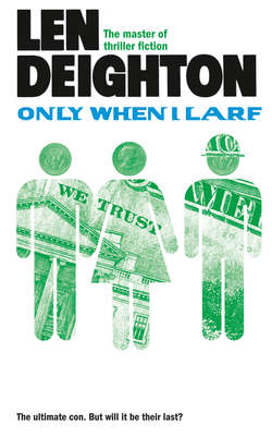
But as I developed this idea I also became struck by how money plays such an important role in Only When I Larf, it is all that Silas, Liz and Bob are interested in. Just as the super rich victims, or ‘marks’, are the kind of people who are ‘made of money’ so I thought that this is what the three confidence tricksters aspire to. I recalled a childhood memory of making paper chains at Christmas and this quickly led to making a dollar-bill paper chain out of the three hustlers, with Liz in the middle of the two men in more ways than one. In addition to the A-line skirt, Liz sports a Susan B Anthony dollar coin for a head, whereas Silas and Bob only merit a half-dollar, perhaps an indication of the relative worth of each character.
The choice of font for the book’s title was inspired in part by the Pan Am livery; its breezy blue and bold lettering being so suggestive of the optimistic, confident period of the 1960s in which this story is set.
The two $1,000,000 notes on the back cover were given to me some time ago on condition that I did not go to a bank and try to cash them! My old British passports came in to play again with a touch of Photoshopping by my wife Isolde. She carefully switched the name of the traveller to one of many aliases employed by Silas. From Santiago, Chile came the period Pan Am airline ticket plus a cocktail swizzle stick for the three confidence tricksters’ ill-deserved in-flight cocktails!
A contemporary NYC subway token decorates the book’s spine. Observant readers will notice that each of the spines in this latest quartet of reissues features a metallic object; a subtle visual link that draws together four books written and set in very different times and places.
I have taken the photograph for this book’s back cover with my Canon 5D camera.
Arnold Schwartzman OBE RDI
Hollywood 2011
