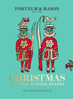
Читать книгу Fortnum & Mason: Christmas & Other Winter Feasts - Tom Bowles Parker - Страница 6
Edward Bawden
ОглавлениеFor many, Fortnum & Mason is all about the food. And rightly so. But back in the 1920s, it added another rather lovely string to an already elegant bow. Because it was then, among the cold, parsimonious monotony of post-war Britain, that a glorious burst of colour exploded throughout the relentless, gunmetal-grey gloom. In the form of the Fortnum’s Commentaries, lavishly illustrated, beautifully written booklets created by Colonel Charles Wyld, the legendary Fortnum’s managing director, in partnership with Hugh Stuart Menzies and Marcus Brumwell, whose advertising agency held the Fortnum’s account.
At heart, the Commentaries were direct mail catalogues, expressly designed to boost sales. But they were done in such style, with such wit and verve, both visual and written, that they far transcend their commercial roots. ‘I visualised little booklets,’ said Menzies a few years later, ‘sent to a carefully chosen mailing list; booklets as readable as something bought at a bookstall or drawn from the library. Every preconceived notion of a trade catalogue was to be violated. Space was to be sacrificed to pure fun in every direction …’ Their enduring appeal is testament to the brilliance of Wyld, Menzies and Brumwell.
And it is many of the pictures from the Commentaries that help illustrate this book. Artists such as Rex Whistler were contributors, and in 1932 Edward Bawden (now, at long last, being rightly revered) started working on a regular basis with Fortnum & Mason. Menzies, in addition to holding the store’s advertising account, was also in charge of the firm’s Invalid Department, a place where all manner of restorative broths and gentle blancmanges were sold to the well-heeled weak and poshly poorly. In the words of Robert Harling, ‘Bawden’s drawings were exactly attuned to Menzies’ almost carefree yet cunningly persuasive prose.’
The relationship continued until the late 1930s, when the war put a swift end to any advertising. Among many other things. Life in post-war Britain was, in many ways, harder, with increased rationing and a country crippled and on her knees. But with the end of rationing in 1955, the relationship with Fortnum’s resumed. Colonel Wyld was dead, Hugh Stuart Menzies would soon follow, and Fortnum’s had been bought by Garfield Weston, a Canadian multi-millionaire for whom the store became a hobby, and then a passion. The advertising firm was now Colman Prentis & Varley, managed by a friend of Bawden’s called Jack Beddington, who had worked with John Betjeman on Shell’s brilliant ‘Shell on the Road’ ads in the 1930s. Bawden now worked with Ruth Gill’s crisp and clean lettering, instead of Menzies’ witty prose, and the results are astounding.
As Mary Gowing wrote, ‘You have only to look at the impeccable yet lively and varied typography of the Fortnum & Mason catalogues (page after flawless page of it) to realise the demands that must have been made on the compositor. The colour, too, with its exciting juxtapositions of cool pinks and luminous scarlet, of blue greens, and green blues, must have been equally demanding of the printer.’
The first Christmas catalogue Bawden did for Weston was in 1955, and he produced some spectacular work each year until 1959. The 1958 catalogue is an extended pun on the word cat, and is full of witty and playful drawings – and one dog. Cats were a passion, and they strut and mewl, dance and grin their way through these remarkable works, along with chickens and sturgeon, elephants, ants and bees. His clean lines, bold colours and whimsical wit delight to this day. And will endure for generations to come.
Now, of course, Bawden is seen as one of Britain’s great painters, printers, illustrators and graphic designers. Part of his enduring appeal is his combination of modernism and tradition. He always believed that a good piece of design was as valuable as a painting (he was endearingly self-effacing and never took anything too seriously), and his work took in everything from iconic London Transport posters in the 30s, to film posters (‘The Titfield Thunderbolt’ being a particular favourite), illustrations for books (his pen and ink drawings for Ambrose Heath’s Good Food series are sublime), as well as book jackets, linocuts, wartime watercolours (from uniformed police officer to Ahwad Abdulla, son of Abudulla the coffee man), even wallpaper. He’s one of those artists you will have come across endlessly, without actually knowing it was him.
Bawden’s association with Fortnum’s was as fruitful as it is eternal. His illustrations have the same immediate appeal now as they did then. He not only learnt his trade at the store but managed to perfect it too. A marriage made in design heaven. Because at Fortnum & Mason, it’s never just about the food.
